the thing about presidential portraits is that they usually aren’t all that exciting. partly [SWEEPING GENERALIZATION] possibly perhaps because there haven’t really been presidents who were particularly interested in art or in portraiture as an art form.
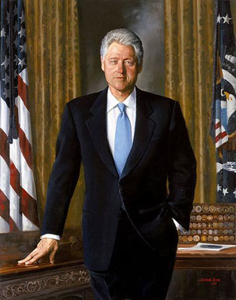
be real: do you remember bill clinton’s presidential portrait?
i was a news junkie as a child and i remember significant portions of the clinton cabinet but, hand on heart, i swear i had never once seen his presidential portrait until i sat down to write this and thought oh, i should google that.
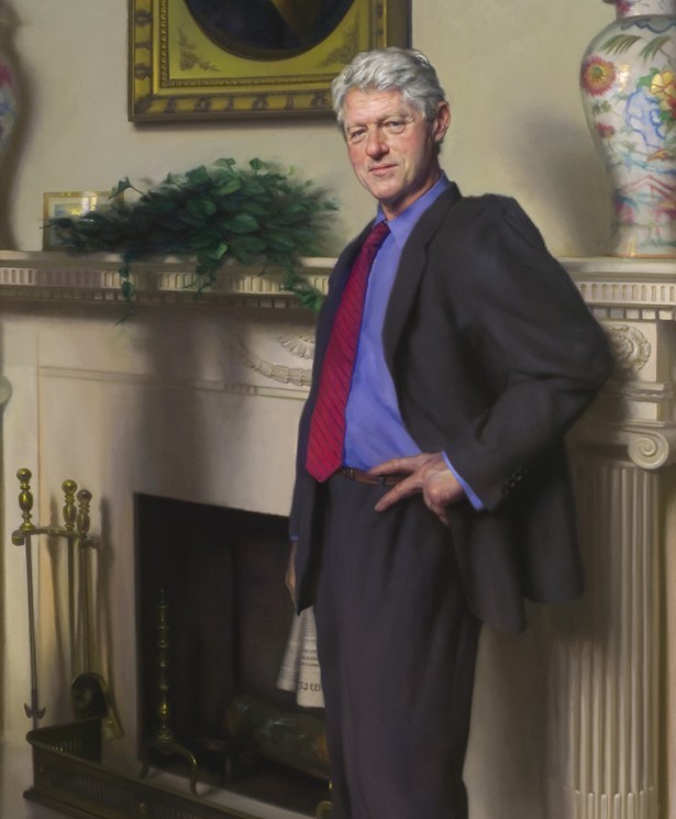
here ’tis:
george w. is slightly more wild west but similarly boring:
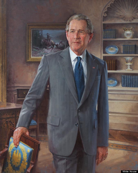
this one is by john howard sanden. clinton’s was by simmie knox, the first african american artist to receive a presidential portrait commission. but the general vibe of both is southern CEO.
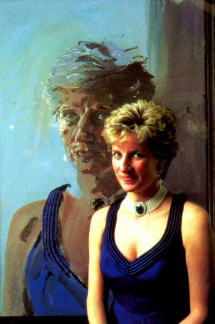
(though confusingly, there’s also a nelson shanks portrait of clinton:
where he looks like robert redford in a restoration hardware catalog and which a number of outlets refer to as his ‘official portrait’. that this was by nelson shanks, of the frilly blouse diana painting:

as opposed to the TOTALLY WAY MORE INTERESTING portrait by henry mee:
makes me now long for a series of american president portraits by henry mee. anyhooo…)
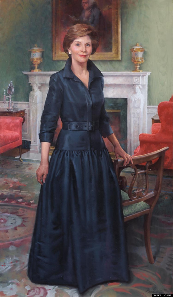
the same dude did laura as did george w.
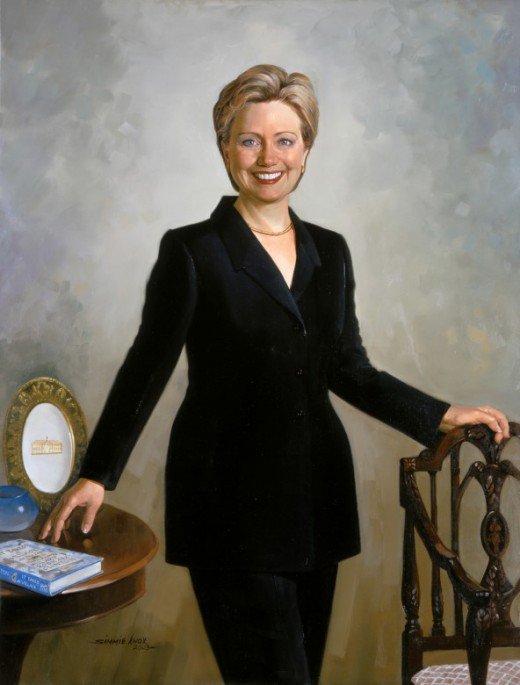
and the same dude did hillz as did bill:
the thing i find interesting about these four is how totally corporate white america they appear. and how not late 20th/early 21st century art they are.
this is like TRADITIONAL TRADITIONALIST TRADITION portrait painting.
seriously, and i am not even making this up, i literally just looked at this painting and thought why is there an early 20th century candlestick telephone back there? is this portrait set in 1902?!

doubtful. but also, wtf is that?
my point is: presidential portraits have historically been BORING.
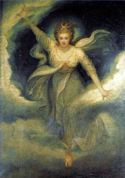
even grace coolidge’s portrait, which i always found profoundly exciting, was profoundly exciting only because it featured a dog.
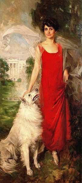
and she wore red and looked a little glamorous. also she seemed to be doing something. at the very least here, we are meant to believe she had taken the dog for a walk on the lawn.
in this sense, HRC’s portrait represented a departure from the traditional first lady portrait in that she was portrayed in more of an office setting than usual. not an actual office, mind you, but she was at the very least dressed as if departing for work. the women prior were more often portrayed as inactive and in fancy dress.
nancy reagan stood in a dark corner, for example.
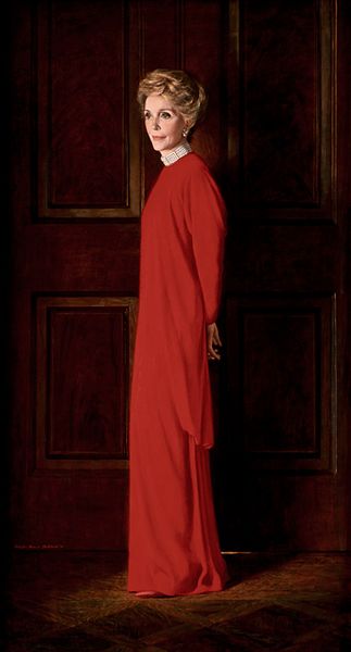
this was said to be a throwback to jackie (or part of nancy’s jackie pretentions), who wore a nightgown and looked tense.

the jackie portrait was HATED when it came out, with attention focused disproportionately on her hands. and the jfk portrait too was rather controversial for its deviation from the norm:
 these were seen as radical departures at the time, though now they don’t look all that wild do they?
but there is a moodiness to the kennedy pics which the other portraits often avoid.
this is straight-forward stuff.

especially the post-kennedy portraits.
lady bird, for instance:

who looks vaguely evocative of one of the less imaginative vigée le brun’s. or betty ford:
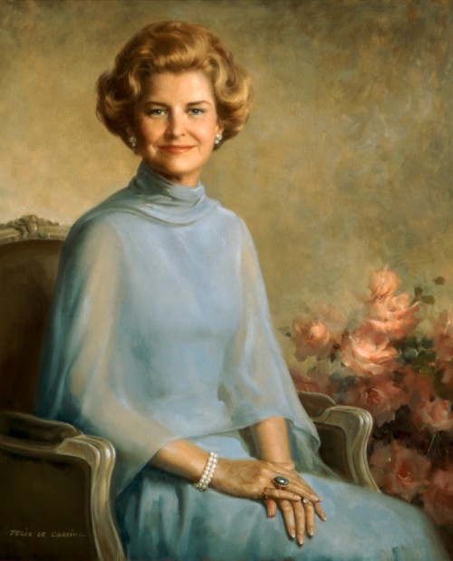
in an image that isn’t all that different from the image any woman might have had produced to celebrate a thirtieth anniversary in 1977.
rosalynn carter’s looks freaking BLEAK in contrast, non?
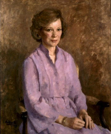
american portraiture in the age of holly hobbie!!
so my point here is not that portraiture is boring. it is that portraiture can be UH-MAZING.
but american presidential portraiture has, historically, but dull as dirt. and there has been an extreme avoidance of any artistic risk.
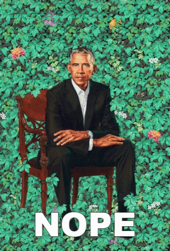
this is one of the many dimensions of what is so interesting about the obama portraits by kehinde wiley (his) and amy sherald (hers).
i cannot decide whether it is that i think every commission that has come before these has been primarily about THE OFFICE- of president or first lady- rather than about the people occupying the office, or if i think it is the exact opposite! that the portraits have treated the occupiers of the office as people rather than symbols and tried to humanize them.
i started with the former but am coming around to the latter. in which case the difference here, with the obama portraits, is that they emerge first and foremost as symbols.
so many of the prior portraits appear to me to have been aimed at trying to capture the sitters as they were, in a specific, pre-established context. this pair jettisons that context and all of that seems secondary to what these people meant.

the presidential portraits are never all in one place together really, but imagine for a moment how this would look. how these images would interrupt the room. how stodgy and antiquated everything that came before would feel upon seeing them and how, in that moment, they would appear a glimpse into the future. a hopeful future at that.

I remember so many of these first lady portraits from a book I had of them as a kid. Jackie’s terrified me because I thought she looked like a ghost and I stand by that seeing it again as an adult. I loved Mamie Eisenhower’s dress but I don’t stand by that one anymore. I think Grace Coolidge’s was also exciting because of that wind-whipped scarf.
for some reason i’ve become a mamie defender of late (an unexpected role about which i am deeply ambivalent) so i do want to give her points for totally owning her “mamie pink” in this portrait. even the gloves! and good catch on the coolidge scarf. hadn’t noticed that. do you think they positioned her in front a fan à la beyoncé?!
She does own it, I’ll give her that! The Southern prom vibe somehow works for her. And yes, there must’ve been a fan hard at work in Coolidge’s…she was America’s Beyonce video before we ever knew how important such a thing would be!